Layout and Visual Design
Layout is to visual storytelling what grammar is to the written word. It guides how we process information with our eyes: what takes priority? What comes next? It places your audience into the role of the main character of a story — the story of how they interact with and navigate the product we have provided them.
I first fell in love with layout design through manga and comic books. How the panels came together on a page, and how the contents of panels interacted with one another to unfold a story, creates an interactive experience between the artist and the reader.
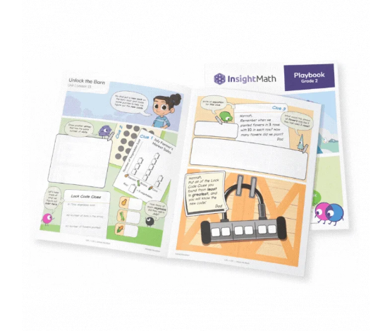
Below, you will find my projects that focus on Layout and Visual Design — from activity books and education materials, to exhibit posters and infographics, to hobby tools. My project list will continue to grow as I seek out new opportunities to work some layout magic, so please stop by from time to time and see what’s new.